animation.gif

Ather Grid

Date
2017 - 2021 (in use)

Client
Ather Energy

Domain

Nomenclature // Brand Identity & Visual System // Brand Strategy // Art Direction // Industrial Design

Team
Samvidh Ramanathan
Krishnanunni Warrier
Ather Industrial Design Team

Visual Renders
Tonic, Mumbai

Recognition & Features
Kyoorius Design Awards


Ather Grid is the electric vehicle charging network for Ather Energy. The brand was established from a necessity to support the rise of electric vehicles across a nation as large as the Indian subcontinent. What started off as a bunch of charging points in the neighbourhood of Bengaluru, Ather Grid is now spread across 50+ cities in India with close to 600 charging points and counting.


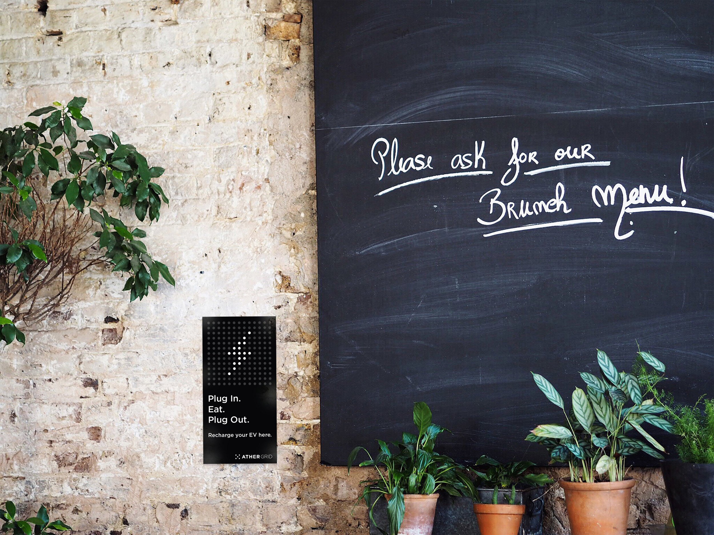
Context // Based on the initial brand strategy workshops conducted with the business and product team, the initial value proposition involved two aspects - one, a minimal cost to the owner for charging and two, a public charger available every 2 kilometres along with a private charger at home. Dependable, premium, forward thinking and ubiquitous were the personality traits that would form the foothold of the brand. The business strategy also involved setting up these chargers at cafes, malls, office spaces, museums and other public locations where customers spend atleast an hour.

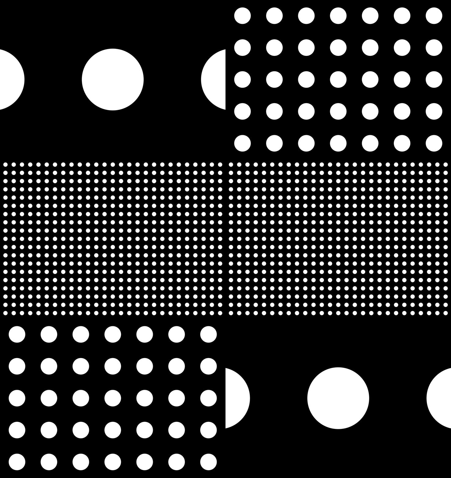
Opportunity // The aim through the brand identity and visual language exercise was to build off the parent brand identity. The aim of proposing the word “Grid” was to make it synonymous with the idea of a nationwide charging infrastructure while also making it easy to remember and run off the tongue. The visual language was also a derivative of a scalable grid where each point is representative of a future charging location.

My Role // The scope of the project was vast and diverse. The work involved everything from conducting workshops for the strategy exercise, project management, the naming exercise, proposing two visual identity concepts and the final execution of the brand touchpoints. Post the completion, the work also involved brand consistency, communication coherence & new initiation projects across a span of 3 years.


The iterations for the final symbol.

The Generation 1 public charger.

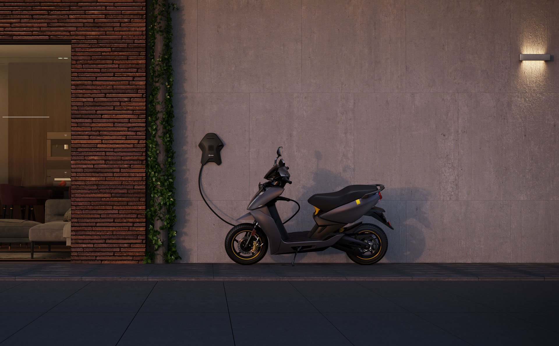
The Generation 1 home charger.