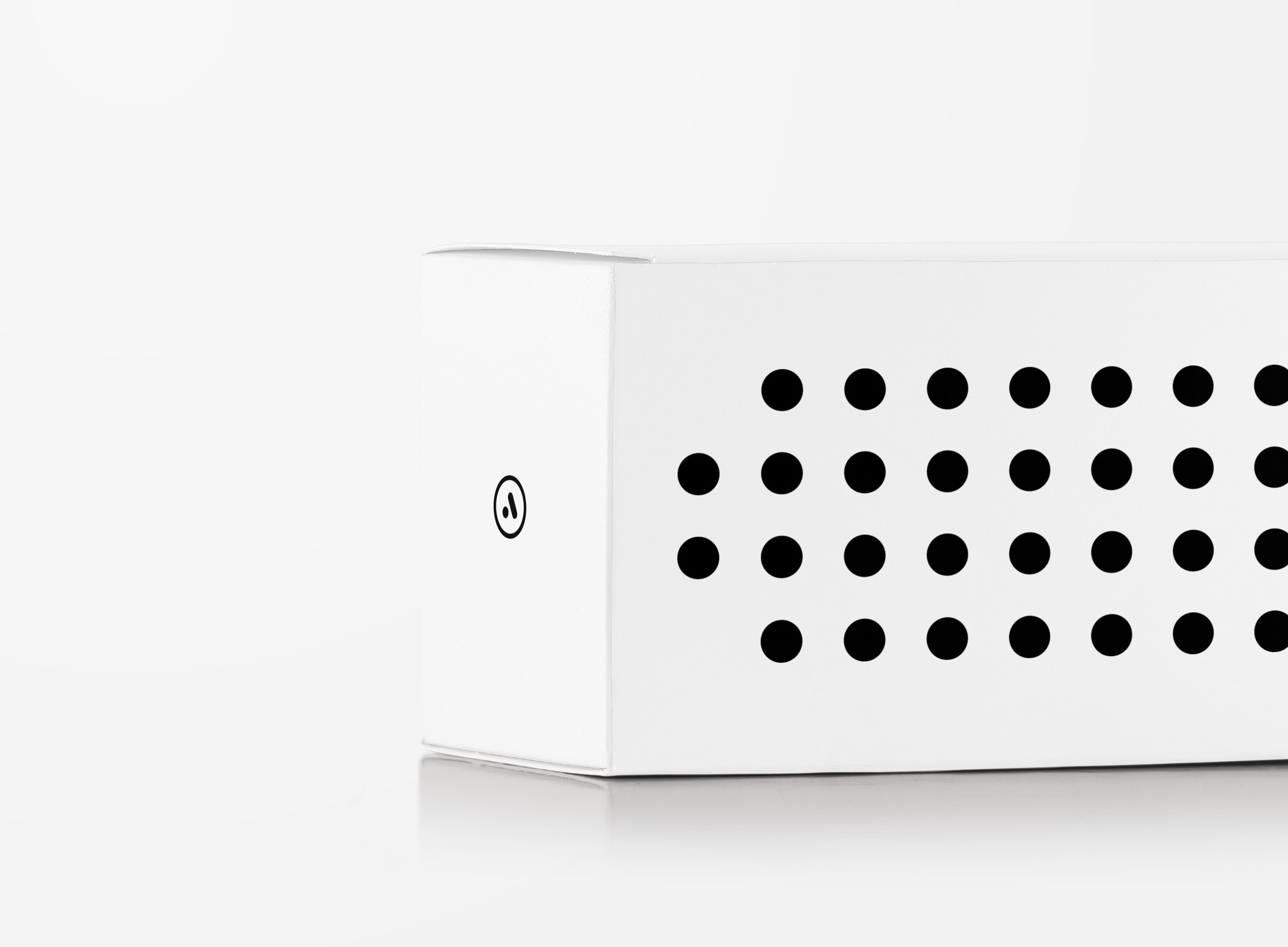
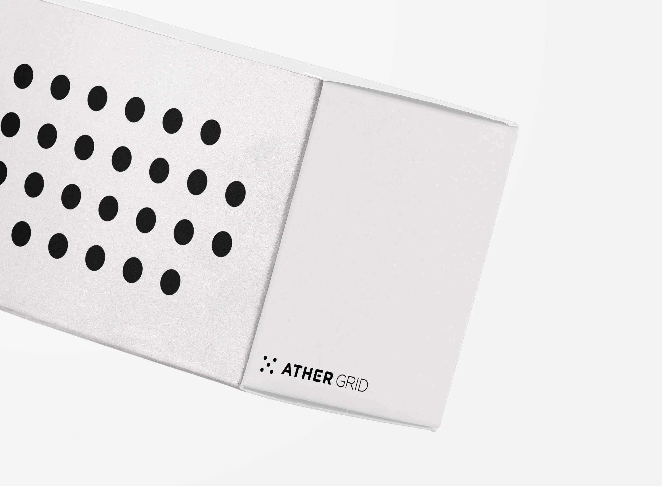
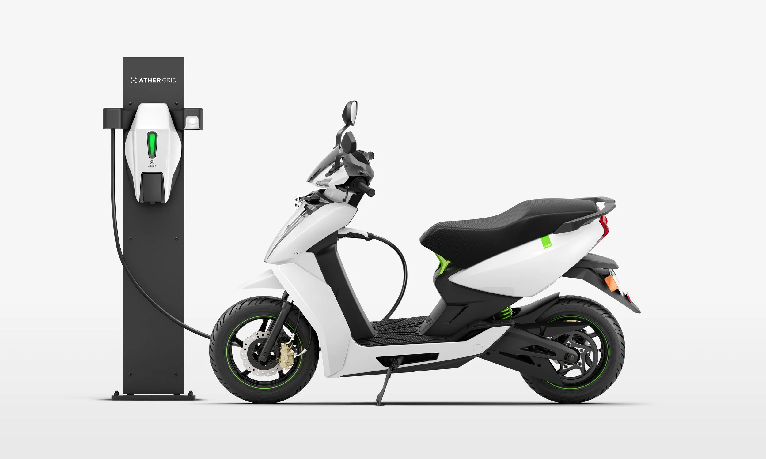
Ather Grid / Visual Identity System

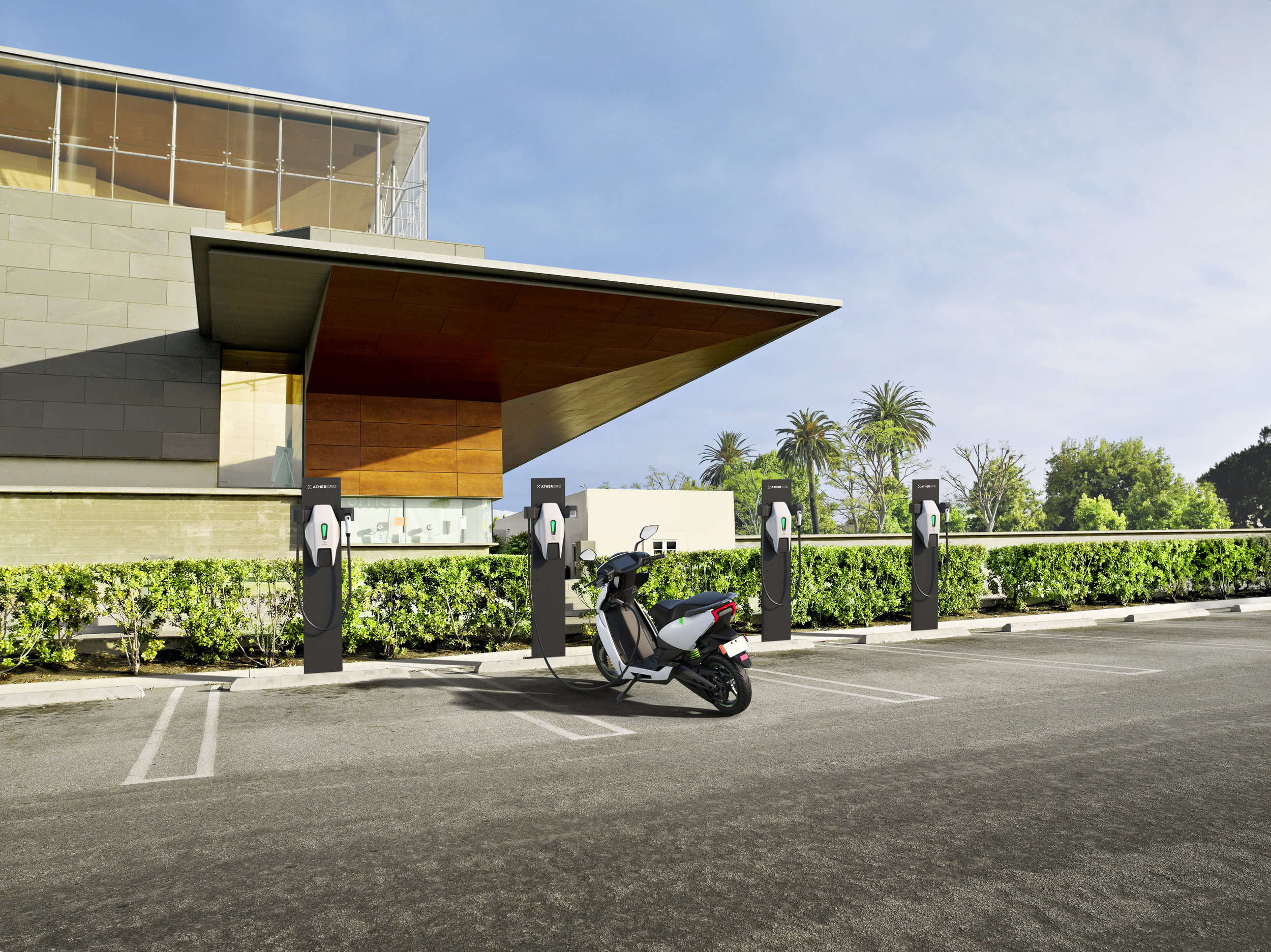
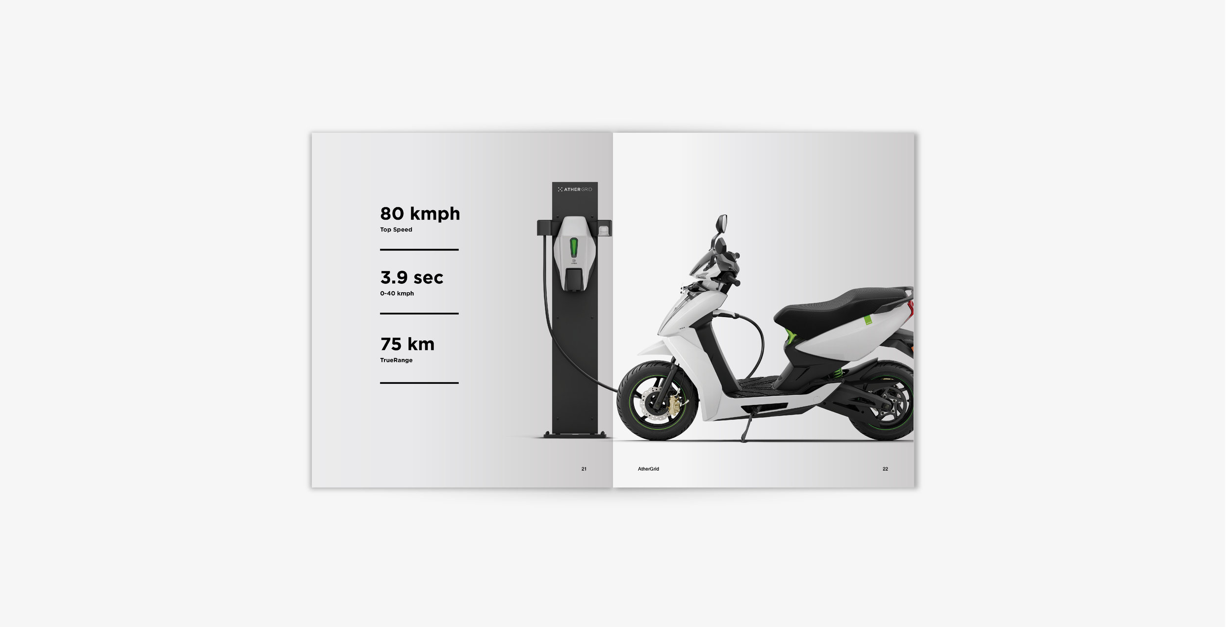
Ather Grid is an electric vehicle charging network. It was born from the necessity of establishing an infrastructure to support the rise of electric vehicles and the need to support the Ather 450 and 340. 

The brief was to develop a brand identity, nomenclature and visual system for this system that would be separate but consistent with the brand Ather. “Dependable, trustworthy, approachable, futuristic, forward thinking, premium and ubiquitous” were the driving traits for this journey.


Branding / Visual Identity / Strategy /
System / Art Direction / Packaging

Date
August 2017

Visual Identity & Art Direction
Samvidh Ramanathan

Visual Renders
Tonic, Mumbai

Recognition & Features
Kyoorius Design Awards 2018
(In-book Winner)


The visual identity and name lend themselves to each other. The journey of starting with one point and slowly adding more points across the city to form one larger grid is how the identity develops. Each point representative of a certain location.

Since, every point is thought through, there is a sense of organisation and cleanliness to the visual identity as well. The circular nature of the points is largely to remain in sync with the parent identity of Ather.


The typography has been crafted to remain in sync but at the same time distinguish itself from the primary brand logotype. The symbol is a simple but intriguing form that’s derived from the most basic form of the grid.

The primary usage of black and white with a hint of electric green is a derivative from the primary colours of Ather and at the same time achieves the sense of premium and futurism that we wish to extract out of the brand.

 
athergrid website-04.jpg
AtherGrid.jpg
locate@2x.jpg
Samvidh Ramanathan